


.avif)
Let's be honest—most B2B landing pages look like carbon copies of each other. White background. Stock photo of someone smiling at a laptop. A headline promising to "revolutionize" something. A form with too many fields. And that blue button we've all seen a thousand times.
It's no wonder conversion rates struggle. Your potential clients have seen it all before, and the sameness creates a kind of "landing page blindness" that makes visitors bounce faster than you can say "innovative solution."
So how do B2B marketers break through this monotony to truly captivate their audience and drive action? What separates the high-converting pages that generate qualified leads from the ones that collect digital dust?
This article will provide the inspiration you need for your next campaign landing page, along with actionable takeaways to help make your page stand out. We'll examine real-world examples of B2B landing page examples that don't just look good—they convert visitors into leads and leads into customers.
What Makes a B2B Landing Page Effective?
Before diving into the examples, let's understand what makes a B2B landing page truly effective. Unlike B2C pages that can rely on impulse decisions, B2B landing pages need to convince multiple decision-makers and address complex buying processes.
The most successful B2B landing pages share these critical elements:
- Clear, focused structure that guides visitors through a logical progression from problem identification to solution presentation
- Compelling headline that immediately communicates value and resonates with your target audience's specific challenges
- Strong call-to-action (CTA) that stands out visually and clearly defines the next step in the buyer's journey
- Minimal distractions with limited navigation options to prevent visitors from clicking away before converting
- Customer-centric copy that addresses specific pain points, speaks to business outcomes, and uses industry-relevant language
- Strategic use of visuals that support (not distract from) the message, including relevant product screenshots, diagrams, or data visualizations
- Social proof in the form of customer testimonials, recognizable company logos, detailed case studies, or industry certifications
- Appropriate form length that matches the stage in the buyer journey—shorter forms for top-of-funnel awareness, more detailed forms for bottom-of-funnel decision-making
- Trust indicators such as security badges, compliance certifications, or clear privacy policies that address enterprise-level concerns
Each of these elements works together to create a cohesive experience that builds confidence and moves prospects closer to a purchasing decision.
Now let's look at 15 real-world B2B landing page examples that put these principles into action.
15 B2B Landing Page Examples That Convert
1. ActiveCampaign: Solving Specific Problems
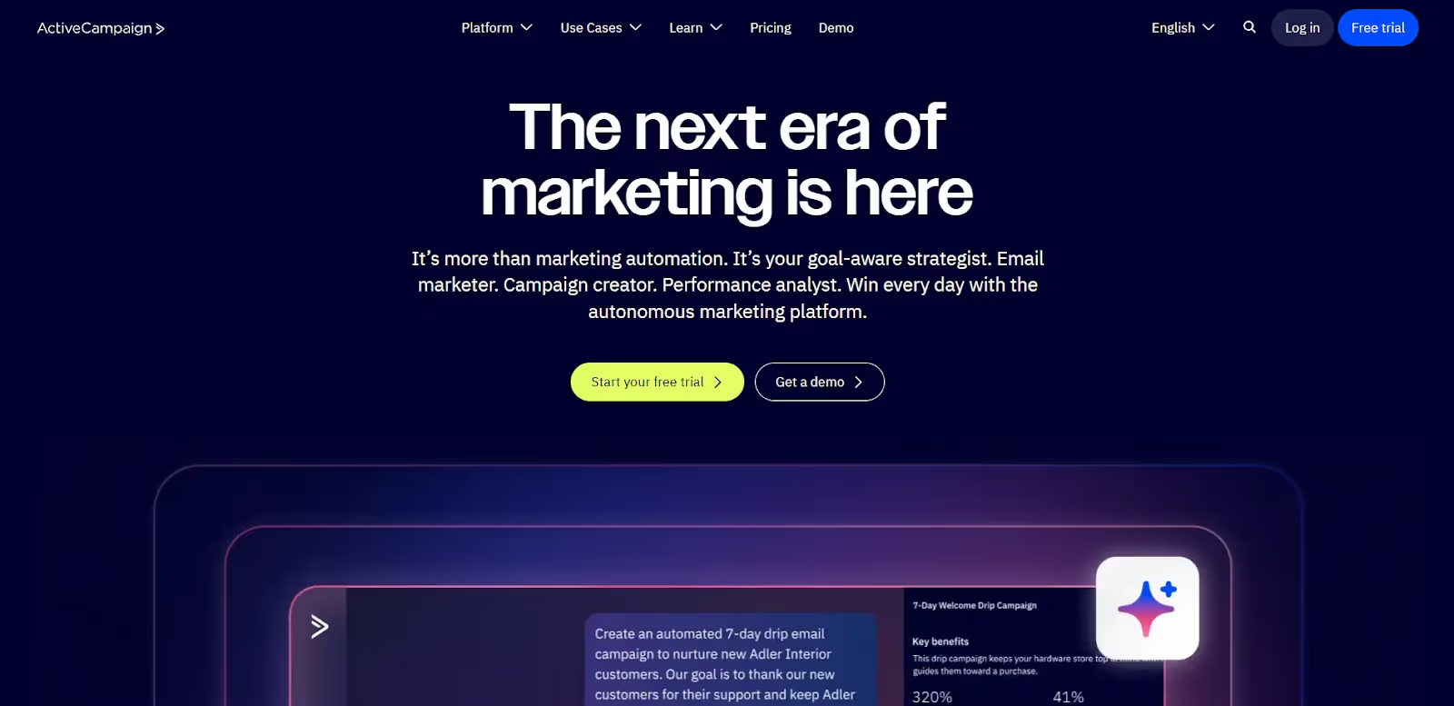
ActiveCampaign doesn't waste time talking about generic email marketing. Their headline cuts straight to what matters: "The next era of marketing is here." In line with their recent AI rebrand, this tech-first approach addresses the varied challenges involved in marketing automation and email, hitting the notes their target audience cares about.
Here’s what you can take away from this B2B landing page example:
- Focus your headline on the specific problem you solve, not your product features
- Use customer-centric language that speaks directly to your visitors' goals
- Position your solution as the answer to a specific challenge, not a general tool
2. Monday.com: Tech-First Approach

Monday.com's landing page demonstrates the effectiveness of a clear, unified value proposition. Their headline "One AI platform for any kind of work" immediately addresses a core B2B pain point—the complexity of managing multiple tools and workflows across different departments.
Here’s what you can take away from this B2B landing page example:
- Lead with universality when your platform serves multiple functions
- Show, don't just tell by prominently featuring actual product interfaces that demonstrate usability and functionality
- Use your AI positioning strategically, as it signals innovation and efficiency—two critical factors in B2B decision-making
3. Shopify: Simplifying the First Step
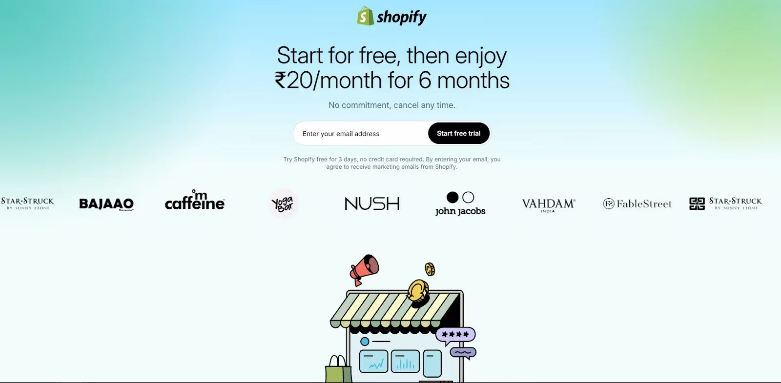
Shopify's B2B landing page makes starting a free trial incredibly simple—just an email address. They understand that asking for too much information upfront can scare away potential leads. By minimizing friction at the first touch point, they can dramatically increase initial conversions.
Here’s what you can take away from this B2B landing page example:
- Reduce friction by removing unnecessary form fields
- Make it easy for the user to convert by creating a painless path down the funnel
- Remember you can collect more information later in the sales process
4. CultureAmp: Human-Centered Trust Building

Culture Amp's landing page excels at making HR analytics feel approachable and trustworthy. The headline "High-performance cultures start here" focuses on outcomes rather than features, while authentic employee photos create an immediate human connection that's often missing in B2B software.
The prominent G2 and Capterra ratings provide instant credibility, and the live dashboard preview showing real employee engagement data demonstrates the platform's practical value.
Here’s what you can take away from this B2B landing page example:
- Use authentic human imagery to build trust and relatability in people-focused solutions
- Lead with business outcomes ("high-performance cultures") rather than technical capabilities
- Use industry ratings prominently to establish immediate credibility
5. Descript: Simplicity Sells
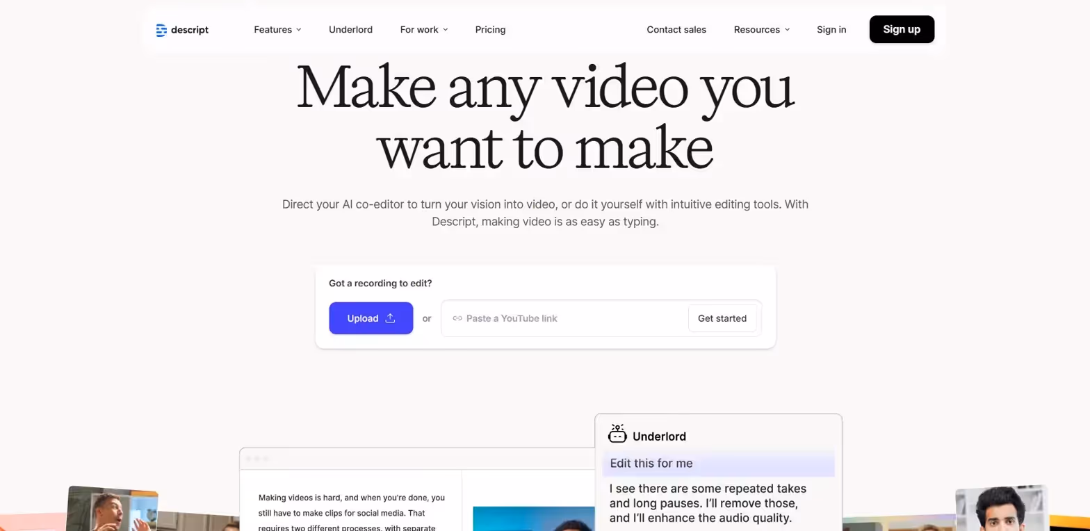
Descript's landing page excels by making something as video editing feel approachable through a simple, relatable promise: "Make any video you want to make." The supporting copy cleverly positions video creation as easy as typing, immediately removing intimidation barriers for non-technical users.
The interactive upload interface and live AI assistant preview demonstrate the product's core value proposition without requiring lengthy explanations, while the "Underlord" AI feature adds personality and memorability to what could be generic AI messaging.
Here’s what you can take away from this B2B landing page example:
- Use familiar analogies to make complex technology and workflows feel accessible
- Create interactive elements like demos that let prospects understand the user experience intuitively
- Use the hero section effectively to show off your product’s various features and capabilities
6. Loomly: Emotional Benefits Over Features
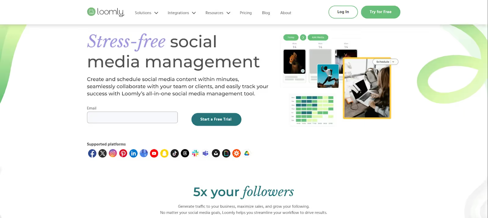
Loomly's landing page masterfully leads with an emotional outcome—"Stress-free social media management"—rather than technical capabilities. This immediately resonates with overwhelmed marketing teams who feel the daily pressure of content creation and scheduling.
The comprehensive platform logos below the fold demonstrate broad integration capabilities without cluttering the main message, while the clean interface preview shows the actual user experience prospects can expect.
Here’s what you can take away from this B2B landing page example:
- Lead with emotional benefits that address real workplace pain points
- Use outcome-focused headlines that speak to desired end states
- Display platform integrations to show comprehensive ecosystem support
7. Salesloft: Results-Driven Messaging
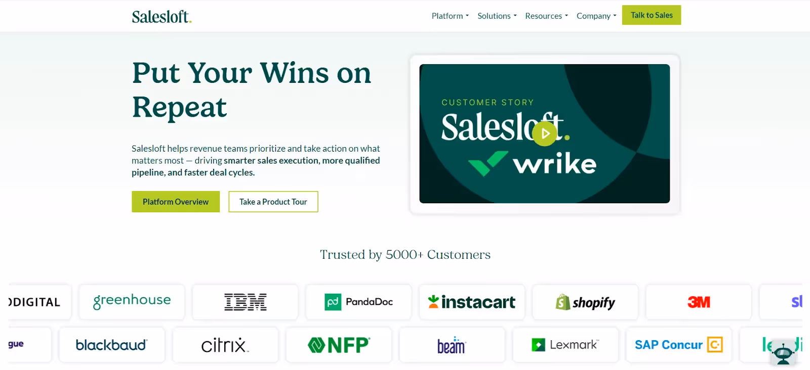
Salesloft's landing page is a clear example of outcome-focused B2B messaging with their headline "Put Your Wins on Repeat." This immediately communicates repeatable success rather than just software features, speaking directly to sales leaders' core objective of consistent revenue growth.
The prominent customer story video featuring a recognizable brand (Wrike) provides instant social proof, while the impressive array of enterprise client logos below establishes credibility and market validation.
Here’s what you can take away from this B2B landing page example:
- Frame your value proposition around repeatable business outcomes
- Feature recognizable customer success stories prominently in hero sections
- Use enterprise client logos to establish market credibility and trust
8. Bonjoro: Interactive Product Demonstrations
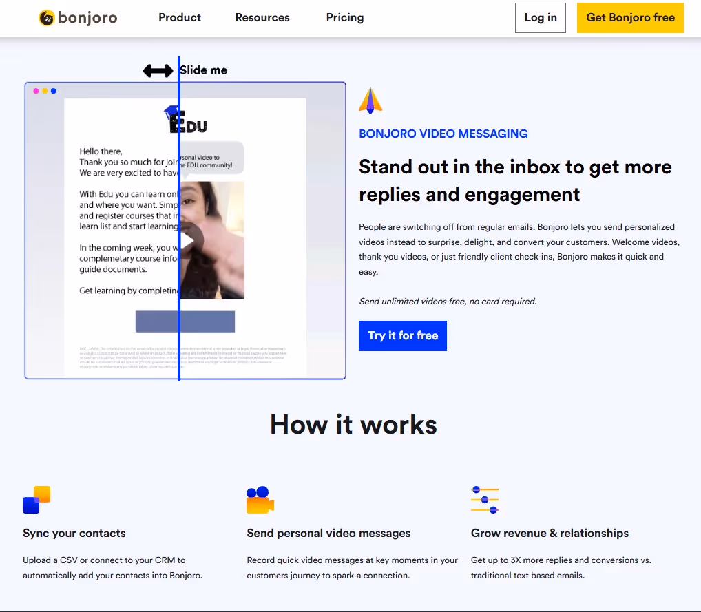
Bonjoro's landing page brilliantly uses an interactive "Slide me" feature that lets visitors experience the core value proposition firsthand. By showing the stark contrast between generic emails and personalized video messages, they make their benefit immediately tangible and memorable.
The headline "Stand out in the inbox to get more replies and engagement" directly addresses email fatigue while positioning video as the solution. The live product demo removes any guesswork about how the platform works.
Here’s what you can take away from this B2B landing page example:
- Use interactive elements to let prospects experience your value proposition directly
- Show clear before/after comparisons to highlight your competitive advantage
- Address specific pain points, like email fatigue) with concrete, measurable statistics
9. Booxi: Aspirational Messaging+Premium Positioning

Booxi's landing page uses bold, aspirational language with "EVERY VISIT HOLDS POTENTIAL. LET'S TURN IT INTO IMPACT" to elevate appointment booking beyond mundane scheduling. The dramatic typography and confident messaging positions their platform as transformative rather than transactional.
The impressive client roster featuring luxury brands like Dior, Tiffany & Co., and Sephora immediately establishes premium market credibility and suggests the platform can handle sophisticated retail environments.
Here’s what you can take away from this B2B landing page example:
- Use bold, aspirational language to elevate commodity services into strategic solutions
- Position your platform through the caliber of clients you serve
- Let premium brand associations do the heavy lifting for credibility
9. Freshdesk: Strategic Competitive Positioning
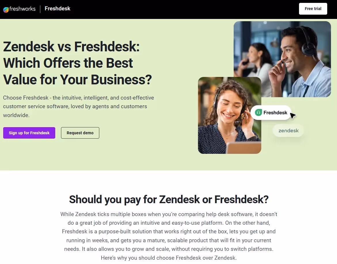
This landing page pulls in high-intent search traffic by bidding on competitor keywords. In this case, Freshdesk is bidding on the “zendesk” keyword, and driving traffic to a landing page that demonstrates bold direct comparison tactics. By immediately positioning themselves against Zendesk in the headline "Zendesk vs Freshdesk", this approach appeals to high-intent searchers already evaluating alternatives.
The page strategically emphasizes ease of use and quick implementation—key differentiators against established competitors—while the authentic customer service imagery reinforces their core value proposition without overwhelming technical details.
Key takeaways:
- Target competitor keywords with direct comparison headlines for high-intent traffic
- Focus on implementation speed and usability as differentiators against established players
- Use competitive positioning to capture prospects already in active evaluation mode
10. Apollo: Visual Architecture and Modular Positioning
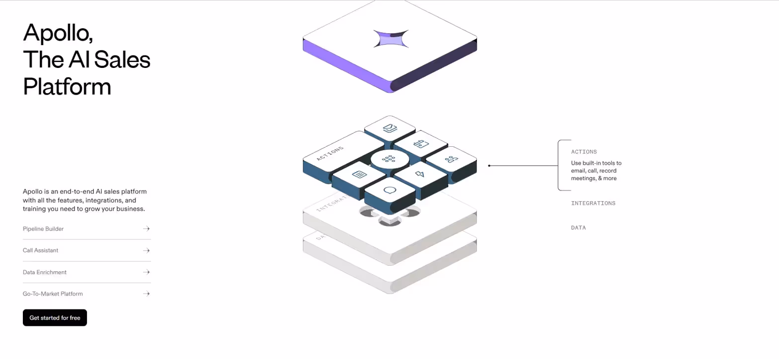
Sometimes, landing pages go beyond just copy. Take Apollo for example; their landing page uses sophisticated 3D isometric graphics to communicate platform complexity in an approachable way. The layered visual architecture with modular components effectively represents their "end-to-end AI sales platform" concept, making abstract integrations feel tangible and organized.
The clean, minimal design with strategic use of purple branding creates a premium feel, while the expandable feature list (Pipeline Builder, Call Assistant, Data Enrichment) allows prospects to explore depth without overwhelming the initial experience.
Here’s what you can take away from this B2B landing page example:
- Use visual metaphors to make complex concepts understandable
- Employ modular design elements that mirror your platform's flexibility
- Balance comprehensive capabilities with clean, uncluttered presentation
11. Lemlist: Building Trust Through Validation
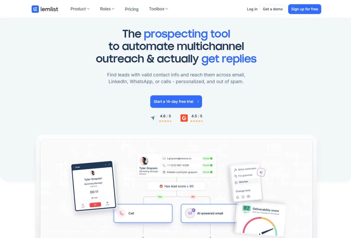
Lemlist's landing page showcases their comprehensive prospecting approach by highlighting multiple communication channels and validation methods. Rather than positioning themselves as just another email tool, they demonstrate how their platform orchestrates personalized outreach across channels by using a handy graphic that showcases a typical usage flow.
Here’s what you can take away from this B2B landing page example:
- Emphasize multi-channel capabilities to show comprehensive coverage rather than single-point solutions
- Use specific metrics and scores to build credibility through transparency
- Show the end-to-end workflow across multiple touchpoints for better user understanding
Implementing Your Landing Page Inspiration
Now that you've seen these inspiring examples, you might be wondering how to implement these ideas for your own B2B marketing campaigns. The truth is, creating effective landing pages presents several challenges:
- Writing compelling, SEO-friendly copy while maintaining your brand voice isn't easy. You need to balance search optimization with messaging that resonates with your specific audience.
- There's also the technical aspect—coding responsive pages that look great across all devices requires expertise many marketing teams don't have in-house.
That's where Yarnit's website builder comes in. Our drag-and-drop HTML landing page builder requires zero coding knowledge, letting you create professional pages in minutes instead of days.
What makes Yarnit different is our integrated AI agents that can generate the exact content you need—whether that's compelling headlines, persuasive body copy, or conversion-focused CTAs, all aligned to your brand voice.
Plus, with over 100 pre-designed templates, you can kickstart your landing page creation with proven layouts inspired by the very examples we've discussed.
The best part? You can implement similar techniques to what you’ve just learned without wrestling with code or hiring expensive designers. From bold visuals to streamlined website layouts, Yarnit makes it all possible with a few simple clicks.
Ready to craft your next high-converting B2B landing page? Try the Yarnit website builder today and put these landing page insights to work for your next campaign. Your competition won't know what hit them.


