

Mobile shopping frustrations hit close to home for most of us. You tap on a product, wait ages for it to load, then squint at microscopic text and fumble with buttons clearly designed for desktop users. It's the kind of experience that sends people straight to your competitors.
Compare that to stores built with mobile users as the priority. Everything flows naturally—images load instantly, navigation feels intuitive, and checkout happens in just a few taps. That effortless experience doesn't happen by chance. It's the result of putting mobile users first in your design process, and there's a good reason: more than 1.6 billion people worldwide now shop primarily on their phones.
Mobile-first design has evolved from a smart strategy to an essential foundation for any Shopify store that wants to stay competitive. The difference between stores that embrace this approach and those that don't is that they don't show up immediately in sales numbers and customer retention.
Let's explore practical ways to implement mobile-first thinking in Shopify Product Pages to create a seamless shopping experience for buyers.
Why Mobile Optimization Matters for Shopify Product Pages
More than 70% of e-commerce traffic now comes from mobile devices, and this share is steadily rising as smartphones and tablets become increasingly integrated into daily life. This reality underscores why mobile optimization is essential for Shopify merchants.
Key benefits include:
- Faster Load Times: Mobile shoppers expect pages to load within seconds. Optimized product pages reduce bounce rates and keep shoppers engaged.
- Better User Experience: Responsive themes adapt layouts and navigation intuitively for smaller screens, enhancing browsing and purchasing.
- Improved SEO: With Google’s mobile-first indexing, mobile usability influences search rankings, helping you attract more organic traffic.
- Expanded Market Reach: Mobile shoppers represent a diverse and growing audience who often shop on the go. Optimized pages tap into this valuable segment.
5 Essential Tips for Mobile-Optimized Shopify Product Page Design
Crafting a Shopify product page that shines on mobile devices involves strategic choices. Here’s how to get started:
1. Choose a Mobile-Responsive Theme
Start with a Shopify theme explicitly designed to adapt to varying screen sizes, ensuring your layout, fonts, and buttons work flawlessly on any device. This takes the guesswork out of presenting a cohesive experience.The navigation of the webpage should be simple so that users can easily find the product.
For example, the vegan handbag and accessories brand JW PEI structures its mobile site with clear, tappable categories like Best Sellers, Fall Edit, New Arrivals, Shoes, and Go-To Bags. The result? Shoppers can explore collections instantly without scrolling endlessly or hunting through menus—a perfect example of how thoughtful mobile design translates into smoother journeys and faster conversions.

2. Optimize Product Images
Fast loading is critical, so compress your images and use next-generation formats like WebP. Your visuals should be sharp and engaging but not weigh down the page.
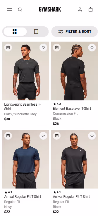
Take Gymshark as an example. The activewear brand’s mobile product grid loads quickly without compromising on visual clarity. Each image is crisp, consistent, and well-lit—showcasing the product’s texture and fit at a glance. This balance between image quality and performance not only enhances user experience but also helps shoppers make faster purchase decisions, especially on mobile, where attention spans are short.
3. Simplify Forms and Checkout
Long forms are a significant pain point on mobile. Limit data entry requirements to essentials only. Incorporate streamlined payment options such as Apple Pay, Google Pay, or Shopify Pay to reduce checkout friction.
4. Organize Content for Easy Reading
Use bullet points, short paragraphs, or collapsible sections to make scanning quick and simple. Put the most important information first, followed by additional details.
Use customer reviews and common questions to create headlines and descriptions that clearly match buyer intent. For crisp, focused product descriptions, try AI tools like Ask Yarnit to transform reviews and queries into clear, conversion-driven copy.
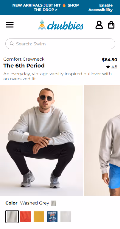
Chubbies is one such example that has a user-friendly menu and clear, benefit-driven product descriptions that make the shopping experience fun on mobile.
5. Utilize Sticky “Add to Cart” Buttons
Keep purchase options visible as users scroll through product details, encouraging immediate action without extra effort.
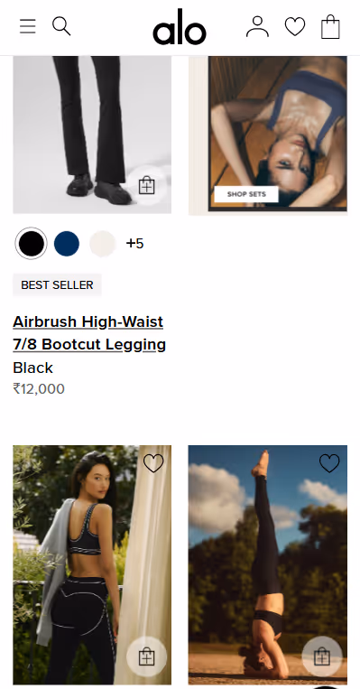
Alo Yoga’s mobile experience turns visual inspiration into instant action. Its sticky menus and swipeable galleries keep purchase options visible as users scroll, driving effortless conversions.
Common Mistakes to Avoid When Optimizing for Mobile
Despite best intentions, brands often stumble. Here are pitfalls to watch for:
- Neglecting Mobile SEO: Optimize metadata, alt tags, and schema markup specifically for mobile indexing. For example, keep your meta title under 60 characters and your meta description under 155 characters to ensure they display fully on mobile search results. Both should clearly and concisely reflect your brand voice to attract the right clicks.To make this easier, Agentic AI tools like Yarnit can generate meta titles and descriptions focused on your target keywords, perfectly sized and aligned with your brand voice—saving time and boosting SEO impact.
- Overloading Pages with Popups: Mobile users have little patience for intrusive or frequent popups, which often lead to immediate exits.
- Skipping Device Testing: Mobile devices vary widely in screen size, resolution, and performance. Testing on multiple phone models and tablets helps uncover hidden usability issues.
- Cluttering Product Pages: Excessive product options, long-winded descriptions, or complex navigation can overwhelm mobile shoppers. Prioritize clarity and simplicity.
Mobile optimization is an ongoing process that directly impacts your Shopify store's success. With mobile commerce growing rapidly and user expectations continually rising, businesses that prioritize the mobile experience will capture more market share.
Implement these strategies systematically: start with theme optimization, focus on image performance, simplify navigation, and test continuously. Monitor your mobile conversion rates and user behavior to identify areas for improvement.
Running an e-commerce store means you have to follow a lot of best practices—from managing design consistency to maintaining seamless functionality across devices. While you’re taking care of making your page optimized for mobile, let Yarnit take care of optimizing the rest according to best practices.