


Here's the truth most marketers forget: people don't read anymore. They scan, scroll, and stop only when something visual grabs their attention.
This explains why infographics are 30 times more likely to be read than articles filled with just text. That's the gap between content that disappears and content that connects.
Over 65% of smart marketers use infographics as a core part of their content strategy. The reason? Articles with visuals get 94% more views than text-only posts. Businesses using infographics gain 178% more inbound links and see engagement rates jump by 650%.
But here's what most guides skip: knowing how to create infographics isn't about picking a template and calling it done. It's about identifying which content works visually, writing instructions that deliver usable results immediately, and refining outputs without starting over.
This guide walks through the real process: the one that turns blog content into shareable visual assets with measurable impact.
Finding Content Worth Visualizing
The biggest mistake? Trying to compress an entire blog post into one infographic. That creates cluttered, unreadable visuals nobody shares.
Use this diagnostic test: Strip your content down to just nouns and numbers. If what remains tells a coherent story, you have infographic material. If it collapses into fragments, keep it as text.
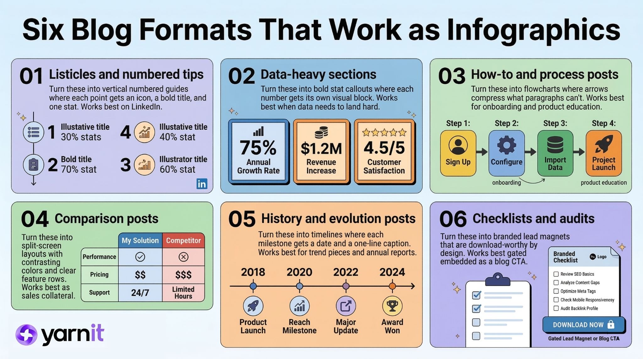
Six blog formats that work as infographics:
- Listicles and numbered tips: Turn these into vertical numbered guides. Each step gets an icon, bold title, and one supporting stat. This format dominates LinkedIn because people scan feeds, not read essays.
- Data-heavy sections: Pull your four to six strongest statistics. Each becomes a bold visual callout. Numbers hit harder when shown, not buried in paragraphs.
- How-to and process posts: Convert these into roadmaps or flowcharts. Arrows and decision nodes compress what prose can't. Best for onboarding and product education.
- Comparison posts: Create split-screen layouts with contrasting colors and feature rows. Among the most-shared formats because people love side-by-side clarity. Also works as sales collateral.
- History or evolution posts: Build timelines with milestones, dates, and captions. We're wired for narrative progression. Works well for trend pieces and annual reports.
- Checklists and audits: These become branded lead magnets. Highest-converting format because they're download-worthy by design. Gate behind a form or embed as a blog CTA.
Once you've identified the right blog section to visualize, you've already done the hard work of breaking your content down into its strongest ideas. That same exercise is the foundation of a much bigger workflow, read AI Agents: The Last-Minute Crisis Manager for Marketers to see how that one deconstructed blog post can be multiplied across your entire social calendar, ad creatives, and more.
How to Create Infographics With AI Prompts
Most people give vague instructions and get generic results. The mindset shift: you're writing a brief. Make it precise enough that AI could act on it without questions.
When learning how to create infographics with AI, this kind of prompt clarity makes all the difference.
Five layers of AI prompt every successful infographic request needs:
1. Role and goal
Define who's creating this and why. Awareness? Lead generation? Social share? Blog asset? The approach changes based on the goal.
Example: "Act as a professional infographic designer creating a shareable LinkedIn asset for a SaaS brand. Goal: drive downloads of our remote work guide."
2. Format
Vertical or horizontal? Portrait or square? Flow, timeline, checklist, comparison, data visualization? Never leave this open.
Example: "Vertical infographic, portrait 1200×1600px, numbered list—five steps with icon, bold title, one-sentence stat."
3. Visual style
Use specific design references like "1970s Swiss graphic design," "editorial magazine layout," or "NASA technical diagram." These work better than "modern and clean."
Example: "Deep navy background, coral accent color, rounded bold headers, minimalist line icons, flat design aesthetic."
4. Content structure
Don't dump raw blog text. Label what's the headline, supporting stat, and subpoint. Think headline-subheadline-body.
Example: "HEADLINE: '5 Habits That Move the Needle' • STEP 1: Time-blocking • STAT: '30% higher task completion'"
5. Constraints
State what must and must not happen. Specify dimensions, platform target, color palette, exclusions. LinkedIn favors 1200×627px, Instagram 1080×1080 or 1080×1350, Pinterest 1000×1500.
Example: "High contrast for accessibility. Icons only—no photography. All text readable at 600px width. Max six visual elements."
Four Advanced AI Prompts Techniques For Catchy Infographics
Once you understand the basics of how to create infographics with AI prompts, these techniques take your results further:
- Few-Shot Style Anchoring
Before your main request, provide one or two example descriptions in the exact style you want. This prevents style drift and reduces back-and-forth rounds. - JSON Output for Design Tools
Ask your tool to return infographic content as structured JSON: headline, items array, stats, hex values, icon labels. Most design platforms accept this, eliminating manual copy-paste. - Visual Planning First
Before requesting the infographic, ask: "Which five data points are most visually impactful? What layout best fits this content?" Use that analysis as your brief. The quality gap between planned and unplanned prompts is consistently large. - Text-to-Image Pipeline
Use a text-based tool to write structure and generate a visual description. Then paste that description into your image tool. This separates content decisions from design choices—each handled by the right tool.
How to Create Infographics Through Smart Iteration
The biggest timesink isn't the initial request. It's a bad iteration. Most people get a mediocre result and ask AI to create everything from scratch. That's not an iteration. That's restarting. True refinement means surgical, targeted adjustment, one layer at a time, based on precise diagnosis of what specifically went wrong.
Here is the five-stage refinement process:
Stage 1: Generate the structural skeleton
Use your full layered request for a first draft. Your only goal: workable structure. Ask your LLMs, if the layout logic is right and if this content type fits this visual format. Evaluate structure first—not style or copy yet.
Stage 2: Diagnose by layer
Review with four questions: Is the structure correct? Is the hierarchy right? Is the style consistent? Are there factual, tonal, or brand errors? Assign each problem to a specific layer before editing.
Stage 3: Write targeted refinement requests
Address one layer per round. Not "make it better"—but: "Keep everything the same. Change ONLY: the layout from horizontal to vertical, and increase the headline visual weight by 30%." Use native variation features rather than regenerating from scratch.
Stage 4: Separate text from design
Tighten every label to under eight words. Each stat should stand alone. Once the copy is locked, render. Fixing a copy inside a visual tool is painful. Fix text first. Always.
Stage 5: Lock a style anchor
Once you have a version that's 70% right, extract working elements into a compact description: "flat vector icons, deep navy background, coral headers, rounded corners, two-column layout." Paste it at the start of every session. Tools have zero memory across conversations; you must re-inject style context every time.
Top AI Tools for Creating Infographics in 2026
Knowing how to create infographics also means choosing the right tool for your needs.
Standout feature: brand-consistency presets paired with style flexibility. You get anime, product photography, cinematic, and flat design modes—all while maintaining your brand colors, fonts, and logo placement automatically. Text rendering is accurate out of the box. Speed advantage: from prompt to exportable asset averages under 90 seconds. Best for teams needing volume without sacrificing visual coherence.
Most reliable for text-heavy infographic content where accuracy matters. Native image mode produces clean, readable text. The conversational iteration loop shines—you can refine structure, tighten copy, and adjust hierarchy in real-time without starting from scratch. Best for prompt development and content extraction from existing blog posts.
Fastest path from blog text to finished infographic, especially for non-designers. Upload a section, AI generates structure, you refine. Template libraries are organized by use case (social media, reports, presentations) instead of vague aesthetic categories. Best for speed and simplicity when design experience is limited.
Canva Magic Design
Advantage: existing brand kit integration. If you already have fonts, colors, and logo assets loaded, Magic Design respects them automatically. The balance between automated generation and manual control is well-calibrated. Best for teams with established visual identities needing consistent output across multiple creators.
The right tool gets you started, but scaling AI-powered content creation across your entire marketing team is a different challenge altogether. Before you go broad, Implementing AI Agents for Marketing: A Comprehensive Readiness Guide gives you the honest checklist of what needs to be in place first.
Time to Revamp Your Content
You no longer need a design team or weeks of back-and-forth. You just need the right blog section, a precise 5-layer prompt, smart iteration, and tools that actually understand your brand voice. Pick one post this week, run the data-dense section through the process, and watch the engagement jump.
If you’re ready to make professional infographics, something your team can create themselves, quickly and on-brand, try your next project today on Yarnit Dreambrush v2. The results will change how you think about content repurposing.


